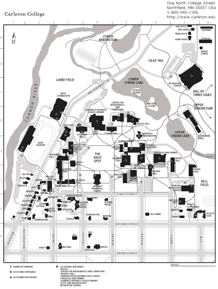
Data
Our interactive web map is built using two historical maps of Carleton College’s campus, both sourced from the Carleton College website. The first map represents the campus before 2008, though the exact date is unknown. We determined it predates 2008 because it does not include Cassat Hall or James Hall. The second map is a current campus map from Fall 2024, which includes new additions such as the Lilac Hill buildings and the Multicultural Center.
To create our interactive feature layer, we compared these two maps and extracted buildings of interest. We then compiled additional metadata for each building, including construction and demolition dates, function, and other relevant details.
Tools
We built our interactive web map using ArcGIS Online and embedded it within a StoryMaps. Initially, we attempted to embed the web map directly into this post, but due to technical difficulties, we opted for StoryMaps as an alternative so that all components of the map are visible. To create the interactive pop-ups for each building, we organized our data in Google Sheets, which allowed us to efficiently manage attributes like construction year, function, and descriptions before integrating them into ArcGIS Online.
What is the Data Visualization Doing?
Our interactive web map allows users to explore how Carleton College’s campus has evolved over time. By zooming in and out, users can navigate the campus and observe how certain buildings have been added, removed, or repurposed over the years. The interactive nature of the map enables users to investigate campus changes at their own pace, focusing on specific buildings or areas of interest.
Each building is represented as a clickable point, and when selected, a pop-up appears with additional metadata, including the year the building was constructed or demolished, its function, address, and a brief description. This spatial visualization helps users not only see the physical transformation of the campus but also understand the historical context behind these changes.
Stylization
To improve readability and enhance the user experience, we applied the following styling choices:
- Consistent symbology: Buildings with the same function share a common icon style, allowing users to quickly recognize related structures.
- Transparency adjustments: We overlaid the 2024 campus map as a tile layer and adjusted its opacity to prevent visual clutter.
- Interactive pop-ups: By providing metadata through pop-ups instead of adding extra labels—since the tile web map layer already includes them—we maintained a clean and navigable interface.
Sources we used to create our visualization
Carleton College. (n.d.). Carleton College Campus Map. Retrieved February 27, 2025, from https://apps.carleton.edu/global_stock/photostock/44573.gif
Carleton College. (n.d.). Official Carleton College Campus Map. Carleton College. Retrieved 27 February, 2025, from https://cdn.carleton.edu/uploads/sites/782/2024/09/Map_11x14_2024-v5.pdf