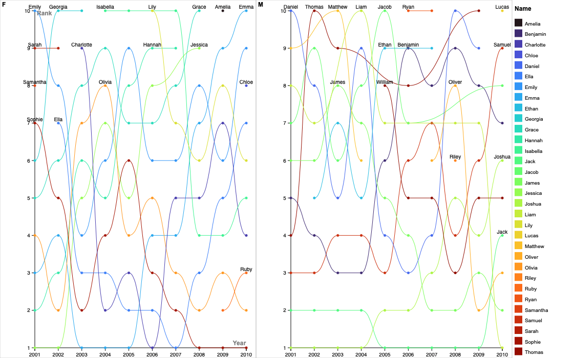
Using the dataset on the most popular baby names in New Zealand from 2001-2010, I created a line chart to visualize the change in popularity over time. I initially tried both Flourish and Rawgraphs.io but ended up using Rawgraphs.io due to its simple layout. Rawgraphs.io is very beginner-friendly with tutorials for each chart, step-by-step instructions, and straightforward customization. I was able to easily choose the chart variables and see which altered the results. Flourish does allow more modifications and interactive visualization, but I was overwhelmed with the interface. As I gain more experience with data visualization, I would love to use a tool like Flourish but at this moment, Rawgraphs.io works well.
With Rawgraphs.io, I created two series of line charts based on gender. My reasoning behind using a line chart is their ability to visualize trends over time with clear patterns, increases, and decreases in the data. By looking at both charts, we can see which years certain baby names were popular using the y-axis (inverted), and how ranking fluctuates along the x-axis. For example, the name Joshua was the most popular baby boy name from 2001 to 2004 but lost its first place spot in 2005 by Jack. I decided to make two series for female and male names due to the quantity of the data. When only using one line chart, the lines were difficult to follow so dividing the two helped. Another change I made to improve clarity was the color of the lines. By assigning each name a unique color variant, the lines are easier to follow. The addition of dots on the data values also makes the yearly ranking clearer.
As I was creating my data visualization, I thought about the points Lin Winton made in her guest lecture. One argument that stuck out to me was the difference in capabilities between humans and technology. There are things that artificial intelligence is better at or at least quicker at compared to humans. We do very well at noticing visual differences in data such as height or correlations while technology is more efficient at taking large quantities of data and compiling it. Tools like Rawgraphs.io help us create visual representations of humanities topics such as cultural trends like baby names. As we reflect on the visual differences, we gain a deeper insight into how our world continues to change.
Hi Lydia! I agree with your point that rawgraphs.io was more beginner-friendly, as that was the graphing tool that I chose to use, too. I like the way you chose to visualize the data with a line chart, since you can see the clear differences in rank over time. When completing this assignment, I was intrigued by the way we were using graphing technologies to represent humanistic data, so I especially resonated with your point at the end about how using visual representations can help us gain insight into the way the world changes!
Your line graph is really interesting! I do like that it is easy to read, though it could be a bit clearer because the amount of names makes the visualization a bit messy. It would be interesting if you could isolate one or two names, essentially making the visualization interactive. Overall though, this graph does a good job of displaying the top 10 names over 10 years. Good job!
Your chart is really visually interesting. I find it interesting that you chose to go with the rankings and not the overall counts for your visualization. I went with the counts to show the size of the gaps between each place, so it’s interesting to see how very similar visualizations differ so much if you just change one thing. I went with a Flourish graph because I liked the interactivity, but I definitely see rawgraphs.io as more beginner friendly.