

See all the graphs through this link:
file:///C:/Users/assat/Downloads/namegraph.svg
Explanation
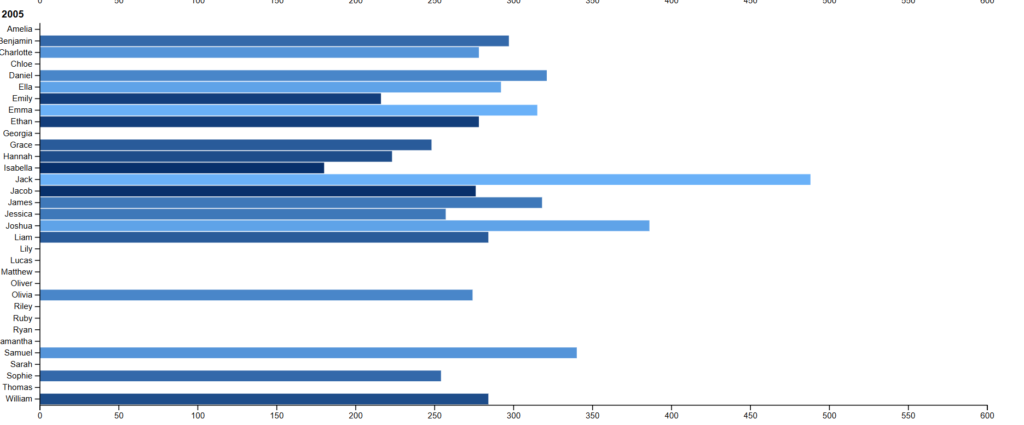
I created seperate graphs for each year and the higher the rank of the name the lighter the color of the bar. I also put the total count of the names as the y axis.
I had some issues with creating my graph. First off, I couldn’t figure out how to separate the names by gender so as a result all of the names are grouped together in the same graphs. I think that this grouping altered the way in which someone would interperate the graphs because in the original data set it wasn’t comparing boy and girl names together. I think that if it were to compare boy and girls names together or, in other words, names in general the numbers would look quite different. I also had issues with keeping the years in the same graph wihtout it looking too clutered so I ended up creating seperate graphs for each year. Above I took a screenshot of 3 of the graphs to show the disparities.
I thought that the bar graph would be the most clear especially with the amount of information given in the data set. There was a couple of other interesting graph types that I tried to use but the visualization did not match up with the data. Before this lab I didn’t realize how important the way you choose to visualize data is, and how different visualizations give off different interperatations.
Connection to DH
The reading about data feminsm brought in some interesting points about how sometimes being counted in the data creates a visibility that is actually dangerous for the people that are being presented. In this regard, data visualists have to be careful and think about who they are presenting and what impacts that could possibly make.
With this assignment I think that not including the gender aspect definitly alters the way the data is supposed to be perceived. What I mean by this is that although it does not pose any dangers or anyting like that, not including the gender seperation between the names probably created a misrepresentation of the data itself.
My visualization relates to DH in the sense that it takes a large data set and transforms it into something that is easier to analyze and interprate. Data visualization in general is key to Digital Humanities because it creates a new way for people to engage with the humanities and it also helps to interprate the source material in a different way.
I agree with your point that data visualization can be dangerous. While the data we used on this assignment isn’t very sensitive, there are a lot of places where bad data representation can be a problem. Visualisations are a powerful tool to help the audience perceive a relationship or trend in a easy way. If done well, it is a valuable tool to assist analysis and persuade. On the other hand, it can be used to misinterpret the data or worse, argue a trend which does not exist.