For this lab, I explored both websites. However, I decided to stick with Flourish because its user interface was less overwhelming, and it offered a wider variety of graph options than RawGraphs.io. Below are the figures I obtained from Flourish.

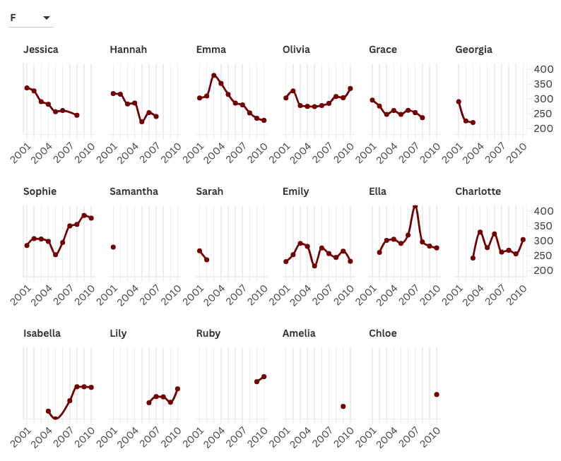
From these graphs, I choose to represent that data using a line and columns combo, with the columns being the years and the y-axis being the total count of children with the name. One option I decided to go with was creating separate mini-graphs of all the different names. Since it looked like there were only 15 names for each gender, I felt that creating a separate mini-graph would be the best way to visualize how the popularity of each name has increased or decreased through the 9 years. Unfortunately, I could not put the HTML code to make this figure interactive as I needed to upgrade my account and buy a membership. However, one choice I made to represent this data was to break up the graphs by gender so it would be easier to visualize. I also changed the color palette as I found the darker colors easier to read.
My choices in visualizing this data are appropriate as the viewer can easily see how each name changed in popularity between 2001 and 2010. The user also can filter out names between genders so they can choose which one to focus on. However, I do acknowledge that there are some limitations to my choice of visualization. For instance, the user won’t be able to get much detail on if male names are more popular than female names. My choice of visualization depends on the question the user is trying to solve.
The most important lesson I got from the readings and Lin’s lecture, is to only add to graphs if they serve a purpose. In other words, keep everything as simple as you can. With keeping this idea in mind, I chose to keep the graphs separate by names to keep the figures as simple as possible. My visualization related to digital humanities is taking quantitative values to represent data that can be used for statistical analysis in the fields of humanities.
I believe that Flourish is a great tool to visualize data in the field of humanities, as it does not require a great background in coding languages such as R and Python, and it is simple to use and can provide a great detail of analysis.
I really like the way that you organized your line charts, I was going to do it this way but then saw you already did it. I want to know how you came up with the html to make the chart interactive and where that feature even is because I did not see anything like that on RAWGraphs but maybe Flourish is just different. I also really appreciate these softwares because it breaks down a level of entry for a lot of people and allows people with no coding knowledge to create graphs that tell a story and are very professional.
Hi Khizar! I think the visualization you chose was very informative and easy to understand. I also did a line graph but rather than displaying each individual graph, I have it where the graph is interactive and displays one name at a time. I do appreciate being able to compare the line graphs for each name. Having the graphs side by side make comparison easier. I also like how you chose a dark red color for your graph since it makes it easily readable!
I really like the simplicity of your display and how each chart is only for one name because it allows the reader to immediately understand what is happening. I like how for each name you can see the pattern over the years and due to it’s simplicity, I believe that absolutely anyone could look at the graphs and understand what is being displayed.