I decided to look into Six Degrees of Francis Bacon, which is a DH project that aims to map the “early modern social network.” (It helped that the project’s name was a riff on Six Degrees of Kevin Bacon, a game I find endlessly amusing.) The network seems to be based mainly England and Great Britain during the 16th and 17th centuries, and as the name implies, is (at least by default) centered on notable Englishman Francis Bacon. It’s hosted by Carnegie Mellon University Libraries and maintained by researchers at mutliple institutions.
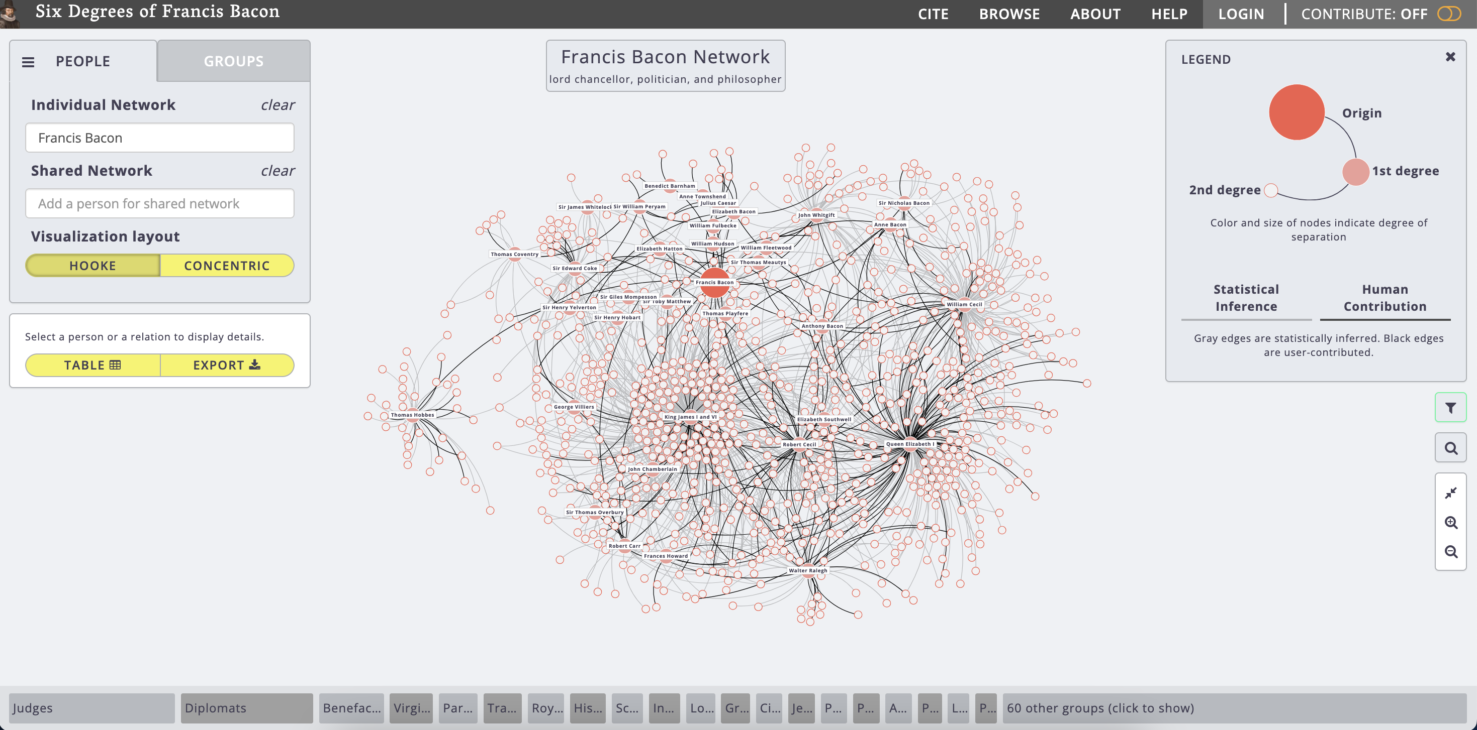
The project looks very complicated at first glance (just look at all those nodes!). However, by breaking it down into its sources (where it gets its data), processes (how it uses the data), and presentation (how it shows us the data), it becomes much more intelligible:
- Sources: This project gets its data — relationships between historical figures — from user contributions. Users can add relationships to the project with a reference source for verification. (I assume that the project was started with a base of relationships that the researchers input themselves, but I don’t actually know.) Relationships that have been recently added to the project are available to browse, and their reference citations are publicly available. References seem to be mainly pulled from the Oxford Dictionary of National Biography, but a few other sources can be seen.
- Processes: The website is built on a Ruby on Rails backend and an AngularJS frontend. (To be totally honest, I’m not really sure the significance of that.) The code repository is publicly available, and other people are able to download it and run it on their own servers. Additionally, there is a neat feature where some relationships on the chart are actually “statistically inferred,” and the code for that is available too. It’s mainly written in R, and it seems to parse out names from the Oxford Dictionary of National Biography and use mathematical relationships to determine if two people possibly had some sort of relationship. It seems really cool (and also totally over my head)!
- Presentation: The relationship web is depicted as interactive nodes, with different color connecting lines between them (black for user-contributed relationships, gray for statistically-inferred ones). It’s possible to recenter the map on anyone and investigate the types of relationships they currently have. It’s also possible to see relationships between whole groups of people!
The project is completely open-source, and its intended audience claims to be pretty much everyone (see the “About” page), from scholars to the general public.
After investigating this project in depth, I’m now wondering how its statistical inference model actually works. It does explain its process on the repository page, but I’d like to know how exactly these models are able to do something as seemingly humanistic as identifying relationships between people. I’d also like to know if these statistically-inferred relationships can be taken as credible, or if a second (human) opinion would be necessary to verify them.
