Spatial Humanities
This week we will be exploring the spatial humanities — a vibrant and increasingly popular area of digital humanities research. Humanities scholarship is currently undergoing a “spatial turn” akin to the quantitative, linguistic and cultural “turns” of previous decades, and many are arguing that the widespread adoption of Geographic Information Systems (GIS) technology and user-friendly neogeography tools are fundamentally reshaping the practice of history and other disciplines. Yet while these powerful computer tools are certainly new, the mode of thinking “spatially” is not unprecedented, and may in fact be seen as a move away from the universalizing tendencies of modern western scholarship towards more traditional understandings of the lived experience of place, emphasizing the importance of the local context.
In practice, much of this scholarship involves creating maps — an act that is not without controversy. Maps are conventional representations of space that come laden with the embedded cultural worldviews of their makers. Maps are also highly simplified documents that often paper over contested or fuzzy boundaries with firm lines; it is hard to express ambiguity with maps, but it is very easy to lie with them.
The familiarity of widespread tools like Google Maps and Google Earth might fool us into thinking these are unproblematic representations of space, but it must be remembered that all maps contain embedded assumptions and cannot be taken at face value. Maps produced in the course of humanities scholarship are not just illustrations but arguments, and they must be read with the same level of critical analysis that you would apply to articles or monographs.
(For more concrete suggestions along these lines, see Humanizing Maps: An Interview with Johanna Drucker.)
Example 1
One area of historical research that saw an early adoption of GIS is economic land use. A good example is Michael McCormick’s book on the Origins of the European Economy, which layered many different types of evidence against each other in a GIS to argue for a much earlier origin to Europe’s medieval economy than had been accepted previously. McCormick made his database publicly available and opened it to collaborators at Harvard and around the world as the Digital Atlas of Roman and Medieval Civilization. The project has grown so much that now it has been relaunched a bigger effort called “Mapping Past Societies.”

The geo-database provides a rich resource and a good introduction to the potential of GIS to reveal patterns and connections through the spatial layering of disparate datasets. It also offers a good orientation to the basic layout of most GIS systems, with a map view window on the right and a list of layers on the left that can be turned on and off.
Explore Mapping Past Societies.
- What layers have been included?
- What patterns show up when you juxtapose cultural, environmental and economic data in this way?
- What connections do you see?
- The developers recently made the decision to separate the layers into different folders
- Are there any problems you foresee with the arguments this decision makes?
- Also take the opportunity to explore the measurement tools at the top of the window to interrogate the spatial attributes of the data.
Example 2
The quantitative data compiled in projects like the DARMC can help address many historical problems, but they don’t necessarily answer more qualitative research questions concerned with the lived experience of the past. For this objective, we must move beyond birds-eye-view 2D maps of spatial distributions and attempt to visualize particular places at particular moments in time. Such “geovisualization” — the digital reconstruction of past landscapes — is another booming area of scholarship that allows us to virtually experience a place as it might have been, and also has the potential to answer important scholarly questions.

The University of Richmond’s Digital Technologies Lab has been a leader in spatial humanities and produced the influential Mapping Inequality project. This project created an interactive interface of maps created by the government sponsored Home Owners Loan Corporation (HOLC), whose work appraising the “risk” of neighborhoods was a major driver of racial segregation via “redlining” in U.S. cities.
- Read this brief NPR article introducing the project and then explore the interface in detail.
- What types of historical info do these maps show? Is the use of historical maps effective?
- What kinds of patterns or historical insights can these maps reveal?
- What are the limitations, or gaps in info, of these maps or their sources?
Group Exercise: The Varieties of Maps
(Exercise borrowed from Lincoln Mullen)
The next step is to become familiar with as wide a variety of maps as possible, including digital maps and analog, maps that have been made by scholars and maps that have not. Below is a list of online mapping projects.
In a group, pick three projects from the list to explore and compare. Your aim is to gain familiarity with projects involving maps and mapmaking, both by scholars and on the web generally.
- American Migrations to 1880
- Antieviction Mapping Project
- Atlantic Networks Project
- Atlas of the Historical Geography of the United States
- Counties Blue and Red, Moving Right and Left
- Digital Harlem
- Digital Harrisburg
- Flowing Data: Coffee, Pizza, Burgers
- Geography of the Post
- Going to the Show
- Hestia: Home for Geospatial Analysis of Herodotus’s Histories
- Hidden Florence
- Histories of the National Mall
- History Pin
- How Your Hometown Affects Your Chances of Marriage
- Hypercities
- Locating London’s Past
- A Map of Baseball Nation, Baseball’s Second-Place Favorites: Go, Mets
- Mapping the Republic of Letters
- Mapping the State of the Union
- Mapping Texts
- Map of Early Modern London
- Mapping Gothic France
- Mapping the Medieval Townscape
- Mapping Poverty in America
- Midterm Elections
- NYPL Map Warper
- Orbis
- PhilaPlace
- Pelagoios
- Pleiades
- Stop and Frisk is All But Gone from New York
- Railroads and the Making of Modern America
- Ben Schmidt, Mapping ship logs
- Spread of U.S. Slavery, 1790–1860
- Travelers in the Middle East Archive
- Visualizing Emancipation
As you look through these projects, consider the following questions or prompts.
- What categories do these maps fit into? Start to envision a taxonomy of maps by considering the purposes of the maps, their audience, and their interfaces, among other axes of comparison.
- What is the grammar of mapping? In other words, what are the typical symbols that mapmakers use, and how can they be put in relation to one another?
- Which maps stood out to you as especially good or clear? Why?
- Which maps were the worst? What made them bad?
- How do scholarly maps differ from non-scholarly maps?
- What kind of data is amenable to mapping? What kinds of topics
- What accompanies maps? Who controls their interpretation? What is their role in making an argument?
- How do recent web maps compare to maps made online in the past few years? Are any of them broken? How can maps be made sustainable?
- Which of these maps are in your discipline? Which maps might be helpful models for your discipline?
Exercise (Georeferencing)
In order to reconstruct historical maps like the mapping inequality project, the first step is often digitizing the data recorded in a historic map by georeferencing (or to be more precise georectifying) that image — that is, aligning the historical map or image with its location on the earth in a known coordinate system. There are many ways to do this, and traditional desktop GIS software is still often the most precise, but we will start with a cloud based solution requiring no complex software.
The David Rumsey Map Collection is a vast archive of scanned historic maps, mostly covering North and South America and Europe. They have enabled a crowd sourcing technique to get the public to help georeference these images for use in GIS applications. The previous version was very buggy and not very accurate, but they have made improvements recently in version 4.
Georectify a historic map
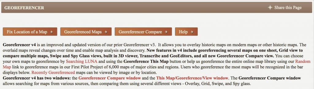
Go to the David Rumsey Georeferencer, select “Fix Location of a Map,” and then EITHER:
- Geo-reference the randomly generated map
- If you don’t like the first map, use the Next button in the bottom right to page through some more options
- NB: You’ll to sign up for a free account if you don’t accept the first couple they offer you.

- Geo-reference a historical map of Northfield/Carleton
- To upload your own map, you’ll first have to create a free account. Select “My Maps” in the top-right corner to go to Old Maps Online and create a free account.
- Once you are logged in, select “add a map,” then “Upload an image,” and upload one of the maps from the Minnesota Digital Library here:
- Search results for “Northfield”, Type:”Cartographic”, Rights:”No Copyright – US”
- Or any other map image you want to try that is published openly on the web.
- Once uploaded, fill out the metadata, then geo-referencer should automatically open
- Note: The free account only allows one map upload at a time.
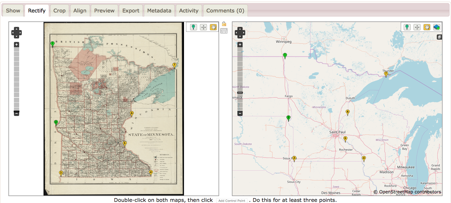
- Using the Geo-referencer:
- Search, pan and zoom to find locations in the image
- Set control points (at least 5 are recommended) by identifying the same place on the image and a modern map
- Clip the map area
- Save to rectify the map
- When you are finished, you will see the map overlaid on a basemap of the world and can compare your work to other historic maps of the same place
- Consider Map in Context: Look at the metadata associated with this map (either under “This Map” or info links in catalog)
- Who created this map and why? What do you think was its anticipated use or purpose?
- Considering the map and its context, are there any implicit “lies,” gaps in info, or distortions of geographic reality with what is shown on the map?
If you need additional instruction, there are detailed steps on the Georeferencer HELP page

Blog Post Assignment (Due Friday)
Your assignment is to share the output of your work and reflect on the possibilities it affords for DH projects.
- With your rectified map, go to the This Map tab and click the sharing icon top right to get a link. (We’ll come back to this and build on it next class.)

- Write a blog post with your thoughts on the process along with the link to your work.
- Did this process change your understanding of the spatial DH projects you explored earlier?
- Examine the This Map page: what formats can you access the map you rectified in?
- What possibilities do you see once you have a georectified map? What would be next steps?
- Are there problems with georeferencing that you should consider?
- What research questions or areas would this method NOT be appropriate for?
Resources
Lincoln Mullen of the Center for New Media and History at George Mason University has developed a fantastic resource for getting started with mapping for the humanities.
The Spatial Humanties Workshop site he developed will give you a detailed introduction to the different types of maps you might want to make as a digital humanist, the software and libraries that are out there to use, and most importantly the academic issues and theoretical questions that are raised by mapping humanities data in a digital space.
NB: Another great tool for online rectifying is MapWarper, which lets you upload your own maps and align them to modern geography.
For an alternate tool, follow these instructions from Lincoln Mullen to Georectify a map with MapWarper
But the NEW BEST THING is open source tools and workflows, and Bert Spaan has been doing amazing work in this space with his Allmaps.org project. This is still in development, but leverages open data models and web technologies like the International Image Interoperability Framework (IIIF), the W3C’s JSON Web Annotation standard, and a JavaScript port of the GDAL transformation library to do amazing things like georectify maps and convert vector GIS layers into image annotations on the fly in the browser.
It’s all very exciting, but still a little unfinished, so we’re holding off on diving in for new. If you’re curious and adventurous, feel free to dive in!
