
The past decade has witnessed a proliferation of web mapping tools and platforms. These tools have long allowed the simple display of and basic interactions with spatially referenced data, but until recently, if you wanted to do any sort of analysis you had to use a desktop GIS system. That situation has begun to change, however, and there are now many solutions for mapping your own data alongside hosted layers from around the web.
There are a lot of open source GIS options out there (see this list for a complete rundown) and which one will be right for you depends on the needs of your project and your familiarity and comfort with coding. Today we’re going to explore some of the most common web mapping platforms available and see how you can start making fairly complex maps with relatively little startup cost.
Exercise (Digitizing from Raster)
Last time, you georeferenced an historic map from the David Rumsey collection. Now that you have coordinates for your image, you can bring it into a GIS program, align it with other spatially-aware data, and digitize the information by creating vector geometry from it.
Rasters are great for imagery or elevation values, but for most purposes we need GIS data in a vector format. Digitizing historic map data is essentially tracing features once you have georectified your image in order to create vector geometry. There are many ways to do this; you could use Google Earth, for example, or the relatively recent MapTiler Editor tool by Klokan Technologies, the same people who make the Georeferencer tool you already used. But since we have a site subscription to ArcGIS online, we are going to focus on that tool to keep things simple.
ArcGIS Online
ArcGIS is the industry leading GIS platform. It is very powerful, very difficult to learn, and very expensive, since it is proprietary software created and owned by a company called ESRI.
ArcGIS Online is the company’s attempt to reach a more mass market audience. It is a cloud-based GIS service that offers an easy way to add, store, and visualize spatial data. But ArcGIS Online also offers sophisticated ways to analyze data that until recently were only available in high-end desktop software, and — crucially for humanities projects — any map you create can be turned into a Story Map like this Mapping Congregants of Color at Old South Church example created by Carleton Students, which offer a great way to integrate your data visualization with your narrative argument, and even add 3D content.
As with the desktop version, ArcGIS is not free, however. It does offer a public version, but it is limited and offers no analysis capabilities. “Subscription” accounts for organizations are not cheap. We are going to use it in this class, because we are fortunate that Carleton has a subscription and excellent support in the person of our GIS specialist, Wei-Hsin Fu. But I’ve also included information on open source alternatives at the bottom of this post.
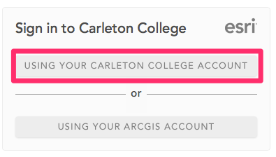
Logging in to your College Account
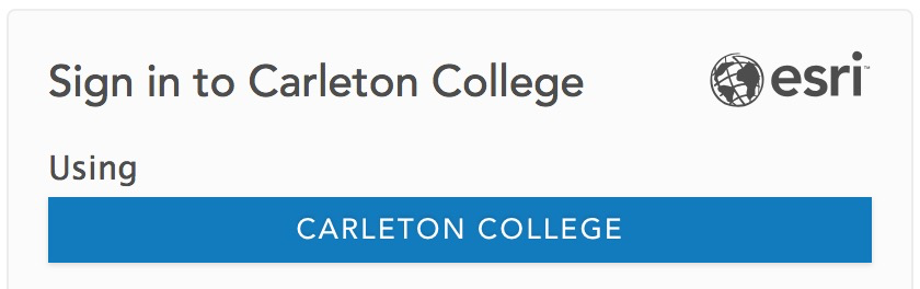
- Our portal for ArcGIS online can be found at carleton.maps.arcgis.com.
- Click to sign in using your Carleton College Account and enter in your regular college login on the following page.
Joining the Class Group
Groups are ArcGIS Online’s way of managing shared access to content. We’ll share everything with the class group for ease of access and use.
- Click the Groups tab at the tab of the page and select the “My Organizations Groups” tab
- Find or search for “Hacking the Humanities Winter 2025” and join the group
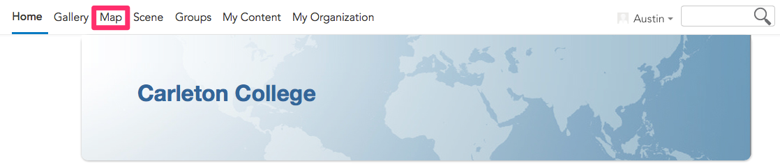
Creating a Map

- In ArcGIS Online, click on the Map tab at the top of the page to bring up the main map viewer window.
- Explore the main map interface. A few things to notice:
- There is an Information button at bottom left that has links to tutorials and resources to learn more, e.g. this getting started ArcGIS Online Mapping Basics video tutorial
- The main operations you can perform are listed down the left hand main menu.
- There is a contextual menu on the right hand side that will give more options based on the layer or feature you have selected as you build your map.
- Both menus can be Collapsed or Expanded with the two pointy bracket arrow buttons at the bottom
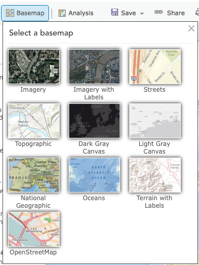
- Click the Basemap button and choose a style. Pick one that is fairly neutral as a background to our data.
Adding Data
Now lets add data to the map. There are several ways to do this
- Go to the Layers menu and click Add to explore the options
- The menu at the top will by default to My Content, but will also give you the options of exploring our group and organization’s content.
- Switch to My Organization and try testing a few layers to see what is available
- Living Atlas will give a vetted list of authoritative data for environmental, statistical and other layers from ESRI and trusted partners.
- Explore the great stuff here that you can use freely in your own mapping projects.
- ArcGIS Online has everything shared publicly by all ArcGIS online users. This is a huge amount of data, but the wild west with no controls over the quality of the uploaded data. Buyer beware!
- Experiment by adding some of the data layers that are available
- The menu at the top will by default to My Content, but will also give you the options of exploring our group and organization’s content.
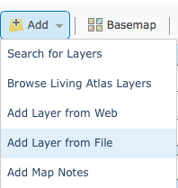
- We can also add our own data via the Add button at the top of the left menu
- Add Layer from URL lets you link directly to geographic layers hosted publicly online by putting in the URL to the layer
- Add Layer from File lets you upload your own geographic data which will be stored on the arcgis servers and count toward your personal data quota
- Create Sketch Layer lets you create new features but sketches will be stored in this map only. Good for quick work and annotating a single map, but not for long term projects or building complex datasets.
- You can also Create Route Layers for direction finding applications and Add Media Layers for imagery
We are going to start by adding a layer from URL to bring in the historic map you georeferenced last time.
Getting a Tile Layer
Modern slippy maps are composed of tiles, and the best way to add a webmap is via a tile layer, which the David Rumsey georeferencer allows.
- Log into your Georeferencer account (or create a free one if you haven’t already), find the map you referenced (or any other map) and click Create new WMTS endpoints on Use in GIS apps section of the This Map tab

- Georerencer has recently changed its pricing model, so they may prompt you to “Please enter your Maptiler Cloud Service Token”
- If that happens, you need to Create a Service Credential with MapTiler, give it a name, then copy it to your clipboard and paste it back in Georeferencer
- You should get a noticed that “WMTS endpoint … is being processed right now. After it’s ready, we will inform you here and also by email.”
- Referesh the page after a brief wait and you should eventually see something like the below, with multiple export options.
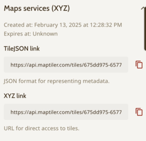
- Copy the XYZ link URL to the clipboard

Note: If you can’t find your account or map, you can use this georeferenced map of Northfield. You can simply copy the link below to use in the next step:
https://maps.georeferencer.com/georeferences/4110c1d1-870c-476e-9568-0f533a2631a0/2023-10-18T15:15:49.510016Z/map/{z}/{x}/{y}.png?key=ML2ztRPmpMX1AoUAH0tK
Adding Tile Layers to ArcGIS
- Choose Add Layer from URL in the Add menu
- Past the XYZ tiles URL into the field and choose Tile Layer from the options below
- The “Title” you type in will be the name of the tile layer in ArcGIS.
- The “Attribution” you type in can help you keep track who created which tile layers and their metadata
- Click Add Layer and see your map overlaid.
- You may need to zoom into its location to find it
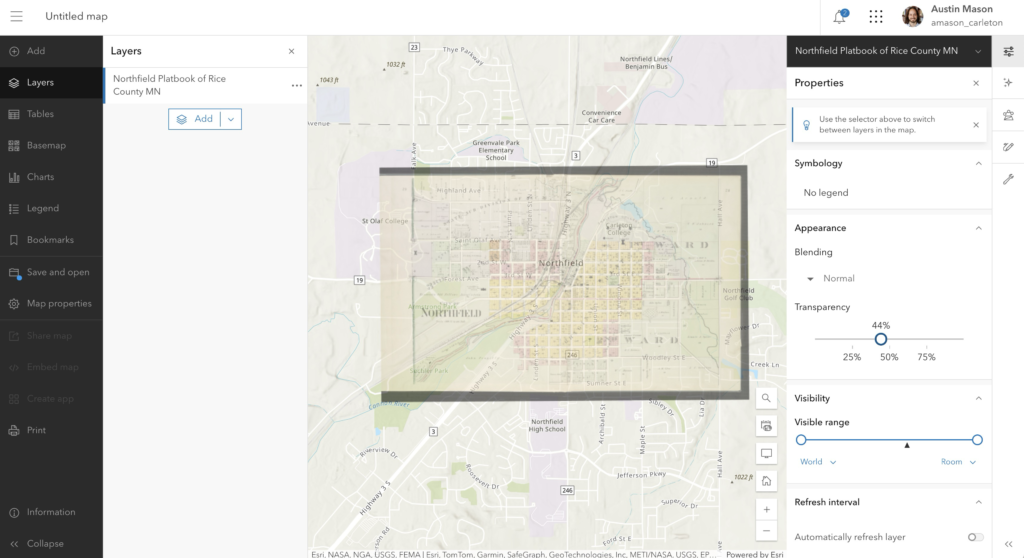
Adjusting settings
- Click on the layer and you should open a contextual menu with several options to the right
- Adjust the Transparency so that you can see through your historic layer to the basemap
- Play with the Visible Range to control at what zoom levels it will display
Digitizing Features from Scratch
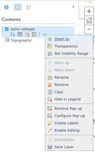
Overlays are great, but to really make use of the data, you need to digitize them and create new vector features. To do this, we’ll create a new layer to hold our features.

- First, Save your map in the left hand menu, and give it a Title and Tags
- Then, go to the Content area of the Home Menu, by opening the Hamburger menu and choosing Content (see image)
- Click the New Item Button at Top Left
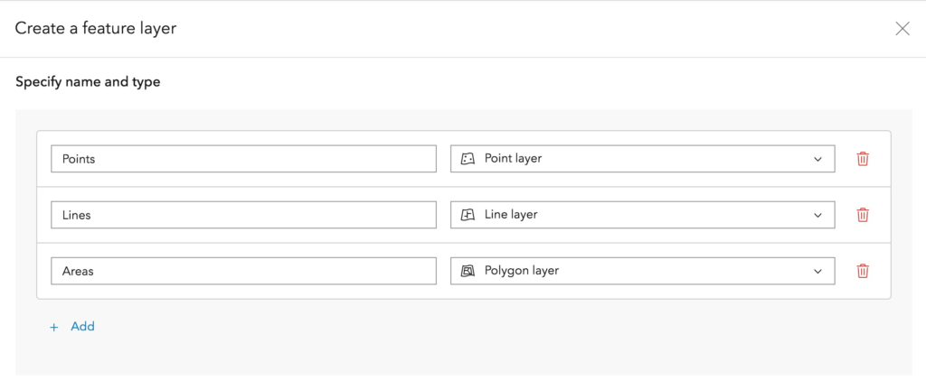
- Choose Feature Layer from the menu
- Choose Define Your Own Layer
- On the Specify Name and Type screen add 3 layers for Points, lines, and polygons and rename
- Give your new layer a Title, add Tags (at least one is required, so “hacking humanities” will do)
- Optionally, you can set the Extent to be similar to your tile map so “zoom to layer” will work as expected
- Once your layer is created,
- Go back to the map view and Open the map you saved above
- Add a layer from your content and load your new layer to the existing map
- Adding attributes and filling in their values to associate metadata can be done a few ways. One is to:
- Go to the Data tab and click on Fields
- Click the Add field.
- Give it a name, display name and type, e.g. Name, Label, String
- Add New Field

- Now digitizing features is as simple as
- Clicking Edit in the right hand menu
- Picking the feature type you want to create from the point, line, or polygon icons at left
- Drawing on the map by clicking with the mouse

Change the Symbology to edit the appearance of all features in a layer
- Go to the Properties tab, hover over the layer, and click the Symbology icon to pull upon the symbology menu
- Select “options,” then “symbol,” and edit the desired color, size, and style of feature
- Adjust the transparency as desired
- Select OK and DONE
Great work! Add a few more features (you can now fill the created field values as you go), then Save your map so we can start a new one. Make sure to Share it with the Hacking the Humanities group.
Exercise: Squirrel!! Map viz example
One of the most common ways to start a new webmap is to upload data from a CSV file. We’ll explore that option through a recent interactive data journalism story by the NY Times that made the rounds of DH Twitter and offers a good example of the how the three pillars of DH projects (sources, processes, and presentation) apply to mapping data.
This @nytimes interactive on the Central Park Squirrel Census is a real-world parable about the necessary imprecision of data collection. Also feat. a peer-reviewed squirrel population estimator! https://t.co/Fnj4tMLYj5
— Lauren Klein (@laurenfklein) January 8, 2020
Watch through the interactive at the link in the tweet above or here on the NY Times Squirrel Interactive (the map is the payoff at the end).
- What issues arise from this project with data collection?
- How accurate is the resulting map, do you think?
- How does the presentation affect your experience of the project?
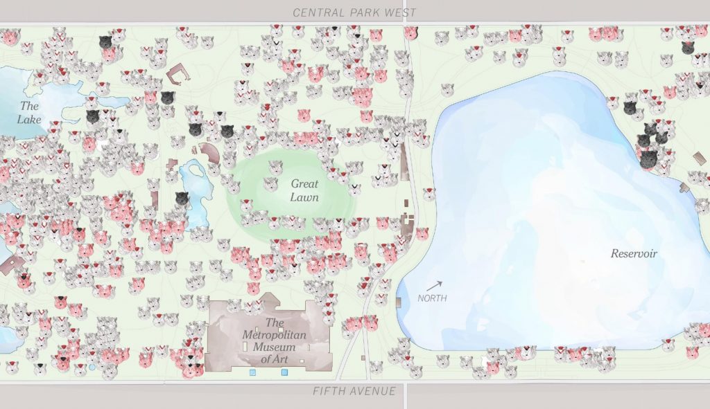
The hand drawn style of this map is hard to achieve with web mapping tools, but we are going to use the squirrel data to explore the basics of the process.
Getting Data to Map
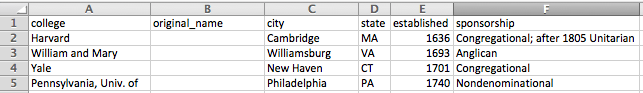
Before we can create a map we need data. Katherine Walden at Grinnell College has made the data for the squirrel census available on GitHub in her ArcGIS Online tutorial, and I’ve forked her project and added a few additional files for our purposes.
Squirrel ArcGIS Tutorial on GitHub
- Download the CSV file either by clicking on the green download button to get the whole repository, OR going to the RAW link for the csv and Saving the page data to your computer
- Open the csv in Excel or a text editor to see what you will be mapping.
- What information does this file hold?
- Where is the spatial data? What kind of spatial data is there?
- What other fields are there? How might we use them?
Upload and Map our Data
Now lets add our data to the map. There are two ways to do this
- Click Add and choose to Add Layer from File then navigate through your computer to find the file you want. Note the types of files they allow you to upload
- You can import a zipped shape file (ZIP: the default ESRI format for desktop GIS that is widely recognized by other GIS and web mapping platforms)
- a comma, semi-colon, or tab delimited text file (CSV or TXT: this kind of tabular data is the most common way to collect your own information and will be portable just about anywhere, not to mention about as future proof as you can get
- a GPS Exchange Format (GPX: this is data upload from a GPS tracker, say following a route you ran or biked that was logged by your phone or another GPS enabled device)
- Drag and drop a file onto the map window
The second option is much easier and quicker, but either way, find “SquirrelData.csv” and upload it.
NB: This data has lat/long coordinates, but if your data doesn’t you would be presented with the following import options

ArcGIS Online will try to geocode your data and provide latitude and longitude coordinates for any place references in your data set by comparing them to a gazetteer (a place-based dictionary) somewhere. It should have correctly recognized the city and state columns as Location Fields
- Click Add Layer and see how it did.
- Click on a couple of the points on your new map at random to verify if they look correct. The geocoder is pretty good, but ArcGIS does not provide much in the way of error checking and you can’t easily tell what it got wrong just by looking. Buyer beware!
Symbolize and Visualize the Data
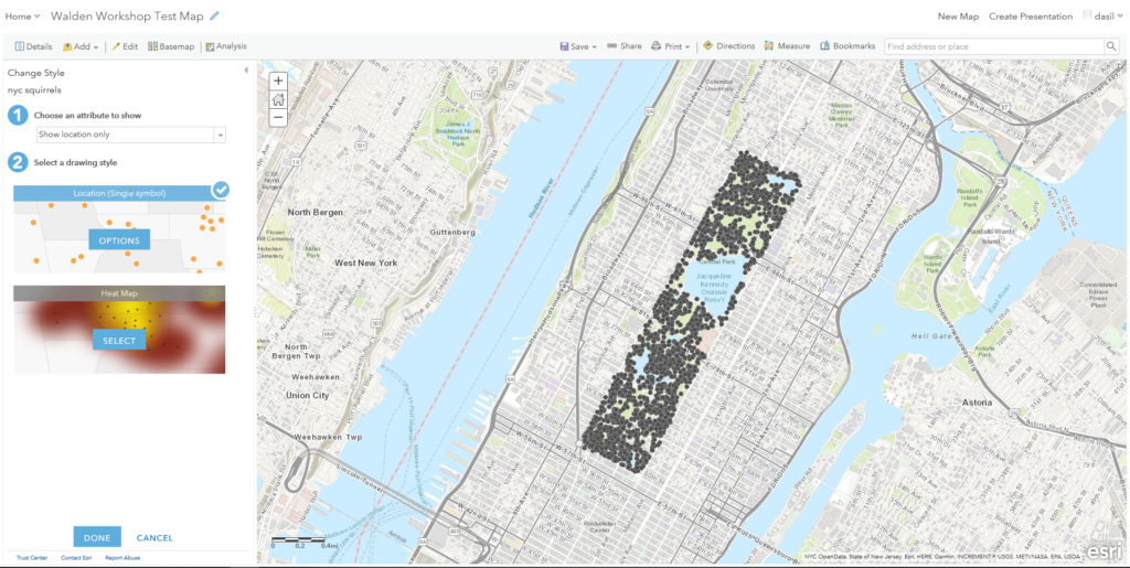
By default, the application will try to figure out some pattern in your data and will suggest an attribute to symbolize by.
- Explore the style options down the left hand column.
- How do the data look if you choose a different attribute to show?
- How do the single symbol, heat map, and types options differ? Which is most appropriate for these data?
- Explore the various symbolization options under the Types (Unique symbols) drawing style.
If you want to make your map look more like the NY Times one, you can upload custom images to use as Icons
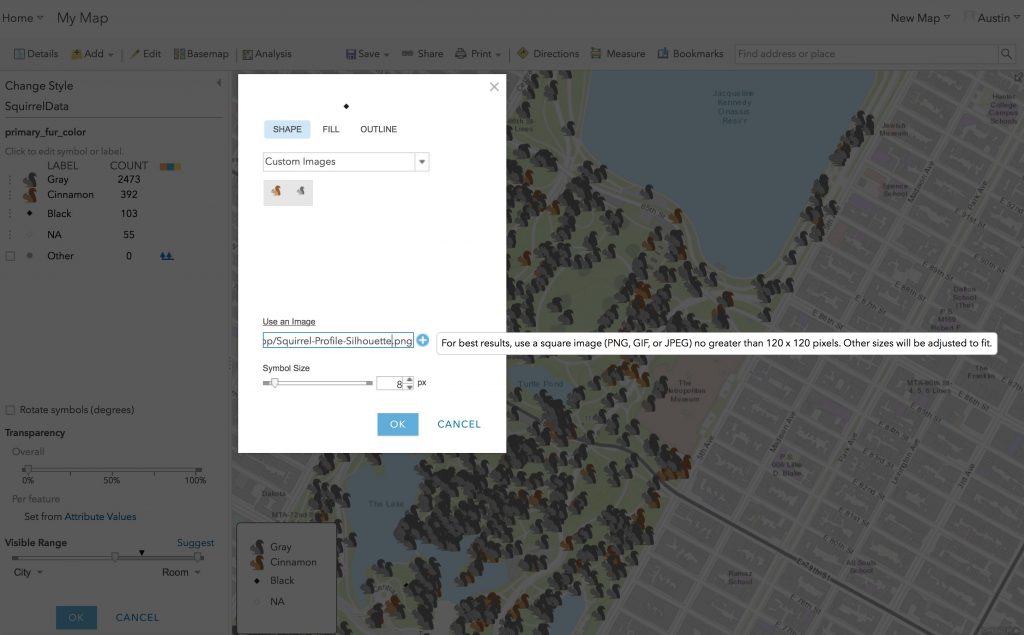
Under Choose an Attribute to show If you set your property to primary_fur_color you can grab squirrel icons for cinnamon, grey and black from the github rep at the links below
Cinnamon Squirrel icon
https://raw.githubusercontent.com/apjmason/ArcGIS-Online-tutorial/DASIL-Workshop/Squirrel-Profile.png
Grey Squirrel icon
https://raw.githubusercontent.com/apjmason/ArcGIS-Online-tutorial/DASIL-Workshop/Squirrel-Profile-grey.png
Black Squirrel icon
https://raw.githubusercontent.com/apjmason/ArcGIS-Online-tutorial/DASIL-Workshop/Squirrel-Profile-Silhouette.png
NB: all icons in the public domain courtesy of Free SVG
- Figure out a map display that you are comfortable with and press DONE when you are finished.
Now that you have mapped some data, what else can do with it?
- Check out the options below the layer and see if you can do the following
- Show the table of the data. How is it different than or similar to the original CSV?
- Create labels for the points that use an appropriate value from the data table, and change the style to your liking
- Configure the Pop-Up to show a Custom Attribute Display and combine the data from several fields into a sentence.
So what? Adding Other Data for Context
We’ve got a map, but what does it tell us? What can we learn from it that we couldn’t learn from reading the data in a table?
One of the greatest benefits of a GIS system is that we can compare different types of data based on their geographic proximity and spatial relationships. ArcGIS online allows access to a multitude of other datasets hosted on its own servers and around the internet. Let’s see how our data look compared to other information. Can we make it tell other stories of interest?
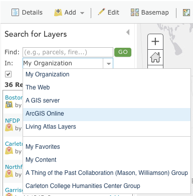
- Click Add again, but this time choose Search for Layers
- See if you can find some boundary layers, population data, religious content, or land cover information that seems to have a relationship with the squirrel data that might be meaningfully interpreted.
You might also search the internet for other GIS datasets that might be fruitfully compared.
Save and Share your map
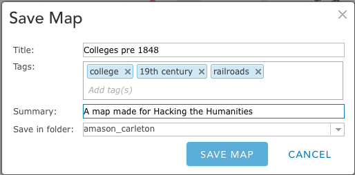
Click Save on the toolbar to title your map and save it to your account. You will need to enter in a title and tags. The map description is optional, but very helpful for keeping track of your own maps and allowing others to understand what you’ve done if you make them public.
Click Save Map when you are satisfied with your descriptions.
You can share a link directly to this map view, but you can also publish a nicer looking layout to share publicly.
You can also create a very elegant StoryMap through the new builder — I’ll show this briefly and we’ll discuss more next week.
Create a Web App for Viewing
You can also create a very elegant StoryMap through the new builder — I’ll show this briefly and we’ll discuss more next week.
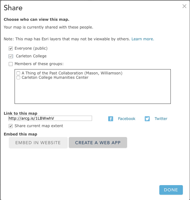
- Click SHARE on the top toolbar. A new window will pop up. Choose to share this with “Everyone” and then click on Create a Web App.
- In the next window, chose the format of the web application. There are many options and you can preview them by clicking on “SELECT” then “Preview”. Once you find a template you like, click on “SELECT” then “Create”.
- On the next screen, enter a title and summary for your application (it can be the same as your map title and description). Click SAVE AND PUBLISH.
Congratulations! You’ve made a live interactive web map!
Embedding in a web page
One of the best things about having your own website with full administrative control is being able to integrate interactive/multimedia content from anywhere through embedded players or iframes that load external HTML within your page. There are some security concerns with doing this too much, or embedding non-secure content (HTTP) in a secure site (HTTPS), but for DH projects, embedding interactives surrounded by well-designed content to provide context and analysis is a key skill.
You can try this out by

- Creating a new page on this or your own site and embedding the new map
- To embed, you want to find the Share icon in the web map you chose, and get the “iFrame” or “embed” HTML code, which should look something like this:
- Then in WordPress, add an HTML block and paste the <iframe>…</iframe> code there.
- To embed, you want to find the Share icon in the web map you chose, and get the “iFrame” or “embed” HTML code, which should look something like this:
- Preview or publish your page to see how it looks
BONUS CSS CHALLENGE
Try to get the embedded map to take up the full responsive width of your page by
- changing the iframe width to 100% (which will make it scale with its container)

Adding a <div> element with class “full-width” and setting the below custom CSS on that element should make the embed’s edges scale right to the edges of the “vw” or Viewport Width. NB: This works best if you are using a single column theme with no sidebar, otherwise it might crowd over the sidebar content.
div.full-width {
    margin-left: calc(-50vw + 50%);
    margin-right: calc(-50vw + 50%);
}
LAB ASSIGNMENT: CREATE YOUR OWN CAMPUS MAP (DUE SUNDAY)
The lab assignment is to take the skills we’ve learned today and test them out by creating your own personal campus map. You should add the following elements to an ArcGIS web map:
- A custom point layer of locations you frequent on campus, made with a “from scratch” .csv data set
- A basemap of your choice
- A polygon layer sketching the footprints of the buildings you frequent
MAPPING LOCATIONS IN A .CSV FILE
- Select five locations on campus that are relevant to your life at Carleton (consult this campus map if needed)
- These may be buildings you have classes in, your dorm, where you have practice, etc.
- Make a copy of this campus locations template and save it your personal folder in our class Google Drive
- Enter the info in the appropriate columns, making sure to create a new row for each location and use standard terms for the “type/function” category
- To find geographic coordinates, go to Google Maps and find the locations of campus buildings, then right-click a spot to see the geographic coordinates and click to copy them
- left-click somewhere to find the address!
- When your data is ready, go to File > Download and export the file as a .CSV
- Note: Save the link to your Google Sheet to share on your lab post.
BUILD YOUR MAP
Sign in to ArcGIS Online and open a new map
- Select an appropriate basemap from the gallery
- Add Spreadsheet Data
- Use the Add Data from File option to upload your CSV
- Customize your map by putting what you’ve learned into practice. Try the following
- Adjust the symbology to show an interesting pattern (hint: try numerical data)
- Add labels to clarify the meaning
- (optional) add popups that include an image of the building (copy image URL from campus map)
- Create a new polygon feature layer (or Map Notes layer), add it to your map, and draw the outlines of the buildings you located. Adjust symbology as needed.
- Save the map
- Share it to the Hacking the Humanities group and Organization
- Create an appropriate instant web app.
LAB POST
Create a post where you embed (or link) your map and link to your .CSV spreadsheet.
Write a brief post to accompany it sharing your thoughts on the decisions you made in your process, the potential of web mapping for DH work in general, and the capabilities of the ArcGIS online platform in particular.
SPECIFICATIONS
- Map
- contains point data with five locations
- contains basemap of choice and polygon layer of building footprints
- contains thoughtful changes to default symbology, labels and/or popups
- is shared with Hacking the Humanities group and organization
- Blog post
- contains embedded (or linked) Web App and linked spreadsheet
- Reflects on process and potential
Alternatives for Web Mapping Tools
Carto
Carto is a “freemium” service, that offers an entirely cloud-based all-in-one mapping service. You can upload your data, perform analyses, and publish from their servers to the web through a very simple and clean user interface. They also offer one of the best styling interfaces around with many nice looking templates and the ability to tweak them or roll your own using the equivalent of CSS for web mapping that is called, appropriately enough, CartoCSS.
One of the big benefits of Carto is their “torque map” feature, which allows you to animate your data with minimal effort. In the map below, I’ve uploaded an early-colleges.csv dataset and animated it so that colleges pop up in the order of their founding. (The dataset can be accessed in the shared folder at this link. (The file, early-colleges.csv, is part of Lincoln Mullen’s historydata datasets on GitHub.)
We won’t go into detail on Carto here, but I encourage you to explore on your own with the same data or a different dataset to see how this tool compares with ArcGIS Online.
Lincoln Mullen has put up a great getting started with CartoDB tutorial that you can use to create an account and follow along, and CartoDB has an extensive series of tutorials to explore its features in more depth.
Resources
- The University of Minnesota’s USpatial group regularly puts on workshops up in the Twin Cities
- Their Training Page offers the full downloadable materials for all of their workshops, which you can use to follow along and learn at your own pace.